

Back to

🤓
Kelly's AppyFace Naming Guide
An emoji-centric naming convention for Bubble apps.
Lovingly prepared by Kelly Claus on December 2022 (Merry Christmas 🎄); lovingly updated on late-September 2024 (Happy Almost-Bubblecon 💙)
Hello, Friend!
Below is a rundown of the [probably overkill] emoji + prefix combo I use when building stuff in Bubble. I do this because I can’t handle how boringly colorless the Bubble builder is (jokes)(but for real), and also because it makes everything more searchable and easier to eyeball. Fair warning, when you first start out with this, it is super annoying and tedious to implement, BUT(!) I swear it becomes second nature once you're in the habit, and it makes it SO much quicker to navigate your app, and way way *way* easier for subsequent developers you hire to know what the hell is going on. And just makes building more fun. Everyone wins.
I’m sure there are many other/better ways to name things. If you have ideas, please holler at me on Twitter. I’m all 👂👂.
Note: There’s some fear out there that using emojis can cause problems in your app. I’ve never experienced this, but if you have, also please give me a shout.
💙,
Kelly
Below is a rundown of the [probably overkill] emoji + prefix combo I use when building stuff in Bubble. I do this because I can’t handle how boringly colorless the Bubble builder is (jokes)(but for real), and also because it makes everything more searchable and easier to eyeball. Fair warning, when you first start out with this, it is super annoying and tedious to implement, BUT(!) I swear it becomes second nature once you're in the habit, and it makes it SO much quicker to navigate your app, and way way *way* easier for subsequent developers you hire to know what the hell is going on. And just makes building more fun. Everyone wins.
I’m sure there are many other/better ways to name things. If you have ideas, please holler at me on Twitter. I’m all 👂👂.
Note: There’s some fear out there that using emojis can cause problems in your app. I’ve never experienced this, but if you have, also please give me a shout.
💙,
Kelly
How to show (and organize) your emoji picker...
A word of warning about using emojis in your app...
🗒️ Page Elements
Make your design editor easier to navigate.
Prefixes / Suffixes
Page Elements
Recommended Prefixes
Abbr.
Element Type
GR
Groups
RG
Repeating groups
BTN
Buttons
INP
Input Fields
RU
Reusable Element
POP
Popup
FG
Floating Group
FOC
Group Focus
ICON
Icon
PL
Plugin Page Element
GRAPH
Graph
TB
Table
Recommended Suffixes (Inputs)
Abbr.
Element Type
DD
Dropdown
DD-MULT
Multi-Select Dropdown
MULT
Multiline Input
RICH
Richtext
CH
Checkbox
TOG
Toggle
RAD
Radio
PH-UPL
Photo Upload
FILE-UPL
File Upload
FILE-UPL-MULT
Mulit-File Upload
SEARCH
Searchbox
DATE
Date/Time Picture
SLID
Slider
Basic Concept:
Replace Bubble's default element prefixes (i.e., "group") with an abbreviation (i.e., "GR")
Why take time to do this:
Visibility in Elements TreeSwapping out the name of the element type (i.e., 'RepeatingGroup A') with an abbreviation (i.e., RG) saves space and lets you see more of the element's name. This is nice because nested elements can get really difficult (or impossible) to read in the Elements tree. Yes, you can expand it, but it's sort of a hassle to do that and I always forget that feature exists anyways.
Sorting workflows together
Granted, elements of the same type will appear together in your workflows in most cases since workflows are alphabetized by element name, but let’s say you’re using two different Icon sets - in your workflows, ‘Icon ABC’ will be far away from ‘MatericalIcon XYZ’ - renaming all icons to ‘ICON [Whatever]’ will display them together.
Similarly, if you're using a group as a button (like we all used to do before Bubble released icons in buttons 🙏💋) changing that group's prefix to BTN will display it in your workflows alongside “real boy” buttons. Since they serve the same function, that's want you want, regardless of what kind of element it is in reality.
Searching for Inputs in your workflows
There are lots of different kinds of inputs and they're all named different things. Radio, Dropdown, Checkbox, omg. Naming them all with a prefix of INP means to find them when you're building out your workflows, all you have to do is type INP and they're all grouped together. A la this business:
Sorting workflows together
Granted, elements of the same type will appear together in your workflows in most cases since workflows are alphabetized by element name, but let’s say you’re using two different Icon sets - in your workflows, ‘Icon ABC’ will be far away from ‘MatericalIcon XYZ’ - renaming all icons to ‘ICON [Whatever]’ will display them together.
Similarly, if you're using a group as a button (like we all used to do before Bubble released icons in buttons 🙏💋) changing that group's prefix to BTN will display it in your workflows alongside “real boy” buttons. Since they serve the same function, that's want you want, regardless of what kind of element it is in reality.
Searching for Inputs in your workflows
There are lots of different kinds of inputs and they're all named different things. Radio, Dropdown, Checkbox, omg. Naming them all with a prefix of INP means to find them when you're building out your workflows, all you have to do is type INP and they're all grouped together. A la this business:
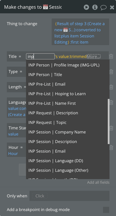
Adding the "input type" suffix to the end allows you to quickly just type "DD" if you don't remember the name of the field, but you know for sure it's a dropdown. This isn't like a critical thing - just a tiny time saver.
💡Handy Little Tip: If you have more than one form on a page, add another prefix to your inputs, indicating which form the input is for. That way, all of the inputs for a form will be grouped together. In the image above, you can see inputs for three different forms - the "Person Update" form, the "Pre-Event Signup" form, the "Add a Request" form, and the "Session Update" form.
This takes a minuscule amount of time when you're actually building the form, and saves SO much time and headache when you're building your workflows.
💡Handy Little Tip: If you have more than one form on a page, add another prefix to your inputs, indicating which form the input is for. That way, all of the inputs for a form will be grouped together. In the image above, you can see inputs for three different forms - the "Person Update" form, the "Pre-Event Signup" form, the "Add a Request" form, and the "Session Update" form.
This takes a minuscule amount of time when you're actually building the form, and saves SO much time and headache when you're building your workflows.
Cases where I definitely do this:
This is a tedious task and slows down building, for sure. So I can understand why people wouldn’t do it. But once you get started, it becomes second nature to do it. That said, if you're like "TOO MUCH, KELLY!" I’d do it in at least these cases:
- All inputs, no matter what
- All buttons
- All groups that look like buttons
- All repeating groups
- All icons
- Top level groups (+ other very important ones)
Emojis
Page Elements
Example
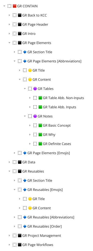
Basic Concept:
Add an emoji to the beginning of certain element names.
Why take time to do this:
HierarchyThe Elements Tree is a lot easier to read than it was before the latest update, but it can still be a big ol' mess of tiny letters and not-all-that-useful icons. Without some sort of method, nothing in there is findable at a glance. The structure of the page is impossible to absorb when everything looks the same. Consistent, meaningful emojis make a page's structure obvious, make important groups easy to find, and make the whole thing a pleasure to navigate.
Your brain wants it.
I might be making this up but I think I heard one time that very smart science people have proven that structure and patterns make us fee safe (or something like that).
You want it.
Emojis are fun. 🥳
Your brain wants it.
I might be making this up but I think I heard one time that very smart science people have proven that structure and patterns make us fee safe (or something like that).
You want it.
Emojis are fun. 🥳
Recommended Emojis
Emoji
Indicates...
Element Type
Emoji Search Terms
🟥
Only for the MAIN group on a page/popup/reusable that holds all the content. There should only be one.
Groups
red, square
⬛️
Level 2 groups, inside of the 🟥 group (basically the page sections)
Groups
black, square
🔷
Level 3 groups, inside the ⬛️ groups
Groups
blue, diamond
🟡
Level 4 groups
Groups
yellow, circle
🟣
Level 5 groups
Groups
purple, circle
🟩
Level 6 groups
Groups
green, square
🔁
Repeating Group
Repeating Group
repeat
🪟
Popup window
Popup
window
🦋
Floating Group
Floating Group
butterfly
♻️
Reusable element (will be added automatically if you follow the naming conventions laid out for reusable elements below)
Reusable Element
recycle
🫙
Empty state element
Group
jar
A word of caution:
Use emojis sparingly outside of the ones shown here! They can become overwhelming and confusing if not used with a very specific purpose.
💾 Data
Make your Data Types & Option Sets easier to navigate and distinguishable from each other.
Data Type Groupings
Data
Example
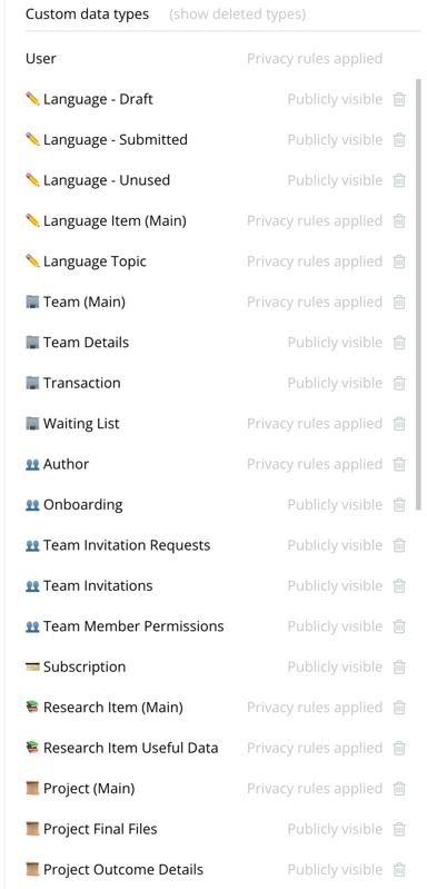
Basic Concept:
Add a meaningful emoji to the beginning of Data Type names.
Why take time to do this:
GroupingBubble will ‘alphabetize’ emojis just like letters, so using the same emoji for related things will effectively ‘group’ them together in your view.
Who wants toreadthings?
When your running a search and your brain is like "I'm looking for a ✏️" you can scroll through your long-ass list of data types at warp speed and just ignore all the 👥's and 🏢's and 🎲's.
New devs will be grateful
Coming into an app you didn't build is like deciphering a new language you've never heard before. Emojis are like a friendly tour guide, showing new devs what's connected to what.
Who wants toreadthings?
When your running a search and your brain is like "I'm looking for a ✏️" you can scroll through your long-ass list of data types at warp speed and just ignore all the 👥's and 🏢's and 🎲's.
New devs will be grateful
Coming into an app you didn't build is like deciphering a new language you've never heard before. Emojis are like a friendly tour guide, showing new devs what's connected to what.
I recommend two types of emojis:
1. Standard for most Apps
Emoji
Relates to...
Emoji Search Terms
👥
Users (user permissions, relationships, etc.)
heads, people
🏢
Entities (companies, organizations, teams)
office, building
💳
Billing stuff (Stripe, subscriptions, payments, etc.)
credit, money
🪵
Logs (scheduled workflows, errors, app activity)
log
💬
Messaging (messages & parent conversations)
chat
📡
Satellite data types (combined with the emoji for the main data type)
satellite
🧩
Core app essentials, esp in option sets (ex: classes, displays, url parameters...)
puzzle
2. Specific to your app
You'll need to go through your app and decide on specific emojis that represent data groupings. It doesn't matter what you use, as long as they're:
For example, in Kicky, a client app I've applied these conventions to, here are a few of the emojis we used...
- Meaningful and obvious (hint: a blue circle means nothing)
- Consistently used across the entire app
- Simple/easy to distinguish as a very small thing
- Visible on both light and dark backgrounds
- Distinct enough from the other emojis you're using to not get confusing
For example, in Kicky, a client app I've applied these conventions to, here are a few of the emojis we used...
Emoji
Relates to...
👨🏻🎨
Artist stuff (profile, history, etc.)
🖼️
Artworks (main record + satellite records
👑
Patron stuff (profile, history, preferences)
🧾
Orders (main records & satellite records)
🚛
Delivery
Note:
For very small apps with only a few data types, I don't do this.
Option Sets
Data
Example
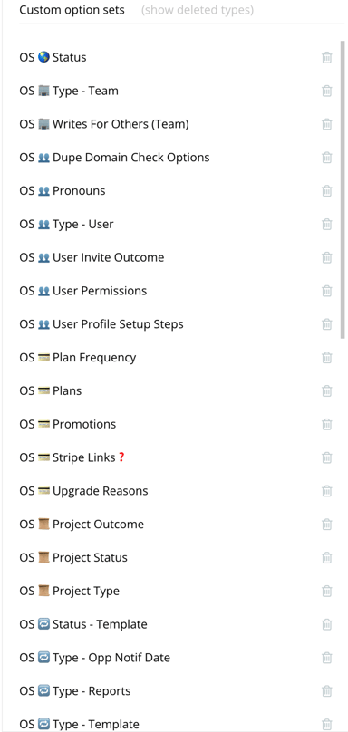
Basic Concept:
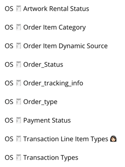
Add an "OS" and the related emoji to the beginning of Option Set names.
Why take time to do this:
Avoid dupesAn app can end up with tonnnnns of option sets. Without a good system to organize them, duplicates can get made, and you can end up with lots of redundancies - especially if there are multiple devs.
Data Types look just like Option Sets
It can be tricky to tell the difference between Option Sets and Data Types when you're searching, setting content types on groups, etc.
Data Types look just like Option Sets
It can be tricky to tell the difference between Option Sets and Data Types when you're searching, setting content types on groups, etc.
The 'OS' Abbreviation
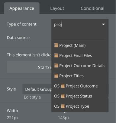
By adding the lettersOSbefore each option set name, you can easily distinguish between Option Sets from Data Types in dropdowns like this:
Emojis
Apply the same emojis to your Option Sets as you have with your Data Types. Again, this will group related sets together, and (BONUS!) make it less likely to create duplicate sets.
♻️ Reusable Elements
Make your Reusables easier to find
Emojis
Reusables
Example
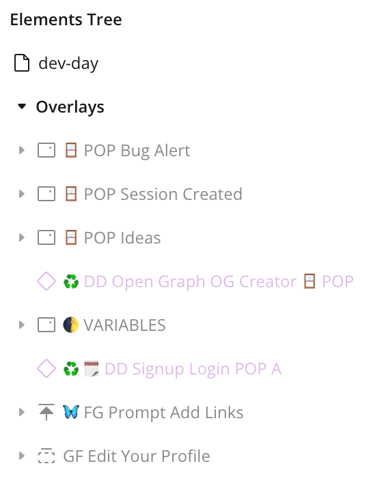
Basic Concept:
Add a ♻️ emoji to the beginning of all Reusable Elements, and add the related data type's emoji as well.
Why take time to do this:
Historically, I've used the ♻️ emoji to distinguish between reusable elements and normal elements on a page.
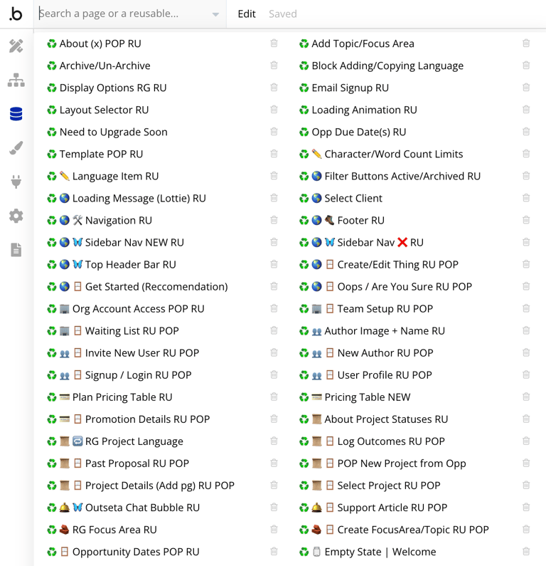
Including the Data Type emoji as well creates tidy groupings in your reusables list.
Including the Data Type emoji as well creates tidy groupings in your reusables list.
That said...
Since Bubble revamped the elements tree (reusables are nowpurple!), the ♻️ emoji isn't all that useful in the context of the elements tree. However, it's still a useful visual in dropdowns when searching for elements, so I'm gonna keep using it.
Abbreviations
Reusables
Example
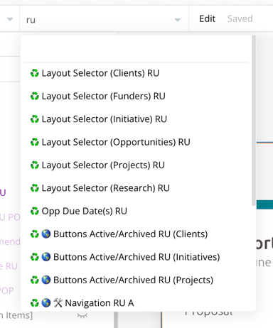
(searching on a page for reusables...)
Basic Concept:
Add an "RU" to the end of all Reusable Element names.
Why take time to do this:
If I need to find or reference a reusable element in my design editor or in a workflow, I need to type in the name of that reusable (who can remember the names of all their reusables?), or I need to search by the ♻️ emoji (annoying). Instead, I can simply add abbreviations to the end of the reusable's name, and then no matter the actual name, I can just type that abbreviation to pull it up quickly.
In addition to "RU"...
It's handy to include the abbreviation you're using for specific element types as well, so you can search for it on a page or in the page/reusable list.
In this example, I've searched for my reusable popups by typing "pop" in the search bar.
(Note: Doing this for groups is useless - it's only really helpful for unique element types like popups, floating groups, tables, etc.)
In this example, I've searched for my reusable popups by typing "pop" in the search bar.
(Note: Doing this for groups is useless - it's only really helpful for unique element types like popups, floating groups, tables, etc.)
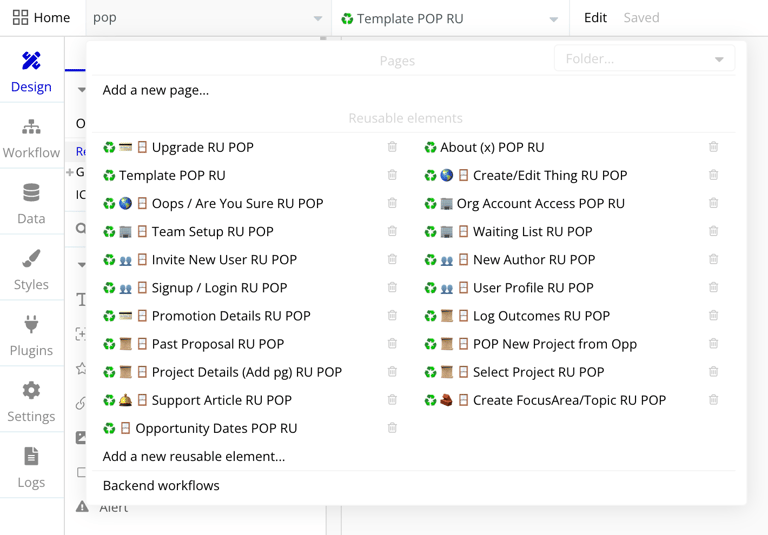
Now that Bubble has moved popups to the "Overlays" section in the elements tree (👍), this is less useful as a way to search. It's still valuable in workflows (i.e., in a "show an element" action, you can type "pop" in the action dropdown and it will find it quickly.
Order in Naming
Reusbles
Example
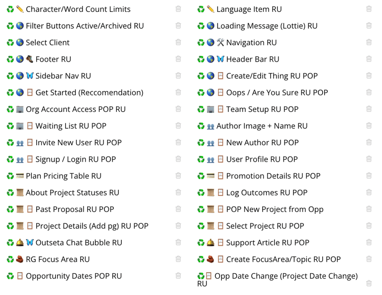
Basic Concept:
Put your emojis, name, and abbreviation in a specific order.
Why this is important:
If you don't order your emojis and abbreviations in a specific way, they won't alphabetize correctly in your page/reusables dropdown.
In the example, all of my "project" (📜) emojis are grouped together, etc.
In the example, all of my "project" (📜) emojis are grouped together, etc.
Emojis & Abbreviations
I recommend the following order for your reusable elements:
♻️ + [Data Grouping Emoji] + [Element Type Emoji] +Actual Name of Reusable+ [Element Type Abbreviation] + RU
The order of the element type and reusable abbreviations don't matter, as long as they both go at the end. They're the least important thing in terms of what you want to be able to see in the elements tree. They're only included for the purpose of searching.
🗂️ Project Management
Communicate history and plans across your team
Intention Emojis
Project Management
Example
Basic Concept:
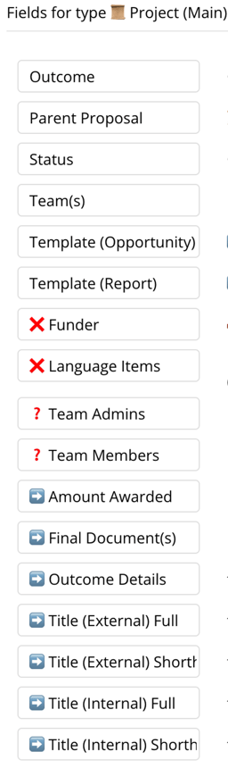
Use a limited number of meaningful & obvious emojis to the beginning (or sometimes end) of the names of things, to indicate something about that thing.
Why take time to do this:
Bubble doesn't provide a ton of ways to communicate the status of things without leaving the platform. By using emojis to communicate your intention with some aspect of your app, you get things out of your head and other devs (or future you) can easily see the status of things without having to think too hard.
Recommended Emojis:
These can be used on anything - a data type, a field, an element, a workflow, an option set..
Emoji
Indicates...
Additional Notes
Emoji Search Terms
➡️
Need to Move Field Elsewhere
Keep using until migration is complete.
arrow, right
❌
Marked for Deletion
Stop using; data migration and UI updates are completed, but double-check everything before deleting.
x
❓
Question / Confusion
What is this? Are we using it? Do we need it? Use in conjunction with comments.
question
💤
Not Currently Using
Plans to use soon, but not ready yet; Likely only partially built.
sleep, zzz
📓
See Comment
Add to end of name so it doesn't mess with alphabetization.
note
🧽
Need to clean this up
Add to end of name so it doesn't mess with alphabetization.
clean, sponge
Note:
This does require maintenance! Once you've migrated a field (➡️), mark it for deletion (❌)... Once you're ready to delete it, actually delete it. And so on.
Team Emojis
Project Management
Example
Basic Concept:
Add "your" emoji to the names of things when adding something new that might be confusing to other developers.
Why take time to do this:
Bubble doesn't provide a way to see who did what in an app. Emojis can help.
Example:
Emoji
Name
Emoji Search Terms
🧔🏻♂️
John
man, beard
👩🏻
Kelly
woman
👱♂️
Nick
man, blonde
Keep a record of who's who:
The simplest (and most immediately-accessible) way to keep track of which emoji goes with which person is to create an option set for Team Emojis. You won't actually use it anywhere - it's just for reference.
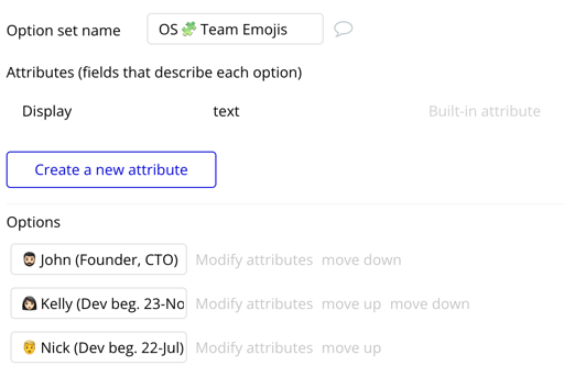
Note:
This really is most useful for the active building process for a feature or flow. Once everyone's cool with what's built, and it's deployed, go back and remove your emoji from the stuff you're keeping (and get rid of the stuff you're not).
🌊 Page Workflows
Get organized and find the stuff you've built
Naming
Page Workflows
Example
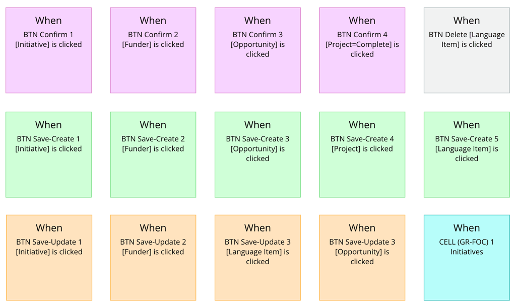
Basic Concept:
Add consistent abbreviations and descriptors to the beginning of elements that trigger workflows so that "like" workflows will automatically group themselves together.
Why take time to do this:
By default, Bubble names workflows with the name of their trigger element (i.e., a button), and then orders them alphabetically. This means the names of your elements will dictate the order of your workflows. Buttons are all together, etc.
That's a start, but without an intentional and consistent naming convention, it's still just a sea of grey boxes and words that all look basically the same.
But WITH a good strategy, you can not only find stuff easier, but can also help your fellow/future devs figure out what's going on in your app.
That's a start, but without an intentional and consistent naming convention, it's still just a sea of grey boxes and words that all look basically the same.
But WITH a good strategy, you can not only find stuff easier, but can also help your fellow/future devs figure out what's going on in your app.
First...
It's important to note that this section is actually about namingelements, notworkflows.
Yes, you can manually rename a workflow in order to follow the convention I'm about to lay out. But starting with your elements kills two birds with one stone (you're also making your design editor easier to navigate).
Yes, you can manually rename a workflow in order to follow the convention I'm about to lay out. But starting with your elements kills two birds with one stone (you're also making your design editor easier to navigate).
How to do it:
If I have more than one element of the same type on a page that serves a very similar function when clicked (i.e. ‘edit’, ‘create’, ‘confirm’, ‘go to’) I’ll name all of those elements with this specific order:
Element Abbreviation + Function + [Data Type]
In the example above, users go through a flow* where each step has essentially the same set of functions (select, create, or edit), and there the same set of buttons that do those things for different data types.
*You can view the layout of this page here if you're curious.
I've named those buttons very specifically, so that they end up grouped together.
Brackets
I use brackets a lot to help me visually distinguish between similar workflows. (If I know all of these workflows are editing something, I can ignore the first bit of the workflow title, and just pay attention to what's inside of the bracket.)
Numbers
If you're extremely intense, like me, you can add a number to the name of the button so that the workflows appear in the same order as the flow of the page.
Brackets
I use brackets a lot to help me visually distinguish between similar workflows. (If I know all of these workflows are editing something, I can ignore the first bit of the workflow title, and just pay attention to what's inside of the bracket.)
Numbers
If you're extremely intense, like me, you can add a number to the name of the button so that the workflows appear in the same order as the flow of the page.
Element Abbreviation + Function +# (Order)+ [Data Type]
Note:
If I have more than one big flow on a page (i.e., a single-page app) you might (miiiiiiight) want to add a one-word indicator of that flow in order to group those together:
Element Abbreviation +Flow+ | + Function + [Data Type]
The alternative to this is folders. (Which are not my fave, for reasons I've expressed somewhere in all this.)
Colors
Page Workflows
Example
Basic Concept:
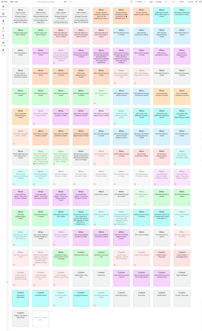
Color "like" workflows (that are grouped together via alphabetizing - see above) the same so they appear as a group.
Why take time to do this:
It can be hard to get your bearings when you're in the workflow tab of a big page. Strategic use of color can cut down the visual overwhelm.
How to do this:
For me, colors are strictly a means of grouping similar workflows together. The colors themselves have no meaning other than telling your brain "this workflow is like these other workflows."
If a workflow does not have any similar workflows, I leave it grey. Page load and "Do When" workflows, I also leave grey.
If two workflows are similar in function but are not grouped together (via their naming), I don't color them the same. (In this case, I consider renaming the element in order to get them placed together.)
If a workflow does not have any similar workflows, I leave it grey. Page load and "Do When" workflows, I also leave grey.
If two workflows are similar in function but are not grouped together (via their naming), I don't color them the same. (In this case, I consider renaming the element in order to get them placed together.)
The other way and why it's 💩:
Some folks use colors to indicate the function of a workflow - blue for creating, red for deleting, etc. I find this pretty useless (sorry, friends who do this). Here's why:
The page to the left has 134 workflows on it. But by using color MY way, I can scan the page and take in the groups (of which there are about 26).
Twenty-six is still a lot, but it's way better than having to visually digest 134 individual workflows.
- You often have multiple functions in one workflow. Which function do you pick for assigning a color?
- When I look at my workflows, I'm not trying to find all the workflows where I'm, say, deleting something. I'm just trying to find the one workflow I need, regardless of what the workflow does.
The page to the left has 134 workflows on it. But by using color MY way, I can scan the page and take in the groups (of which there are about 26).
Twenty-six is still a lot, but it's way better than having to visually digest 134 individual workflows.
Notes
This only really works if you use the element naming convention above. Unless the workflows are grouped together, coloring them the same does nothing.
Yes, it takes time. And yes, it is very annoying that you can't change workflow colors in bulk. But I promise, it will save you a ton of time in the long run. It will also make you happy because color is fun.
Yes, it takes time. And yes, it is very annoying that you can't change workflow colors in bulk. But I promise, it will save you a ton of time in the long run. It will also make you happy because color is fun.
🎒 Backend Workflows
Get organized and find the stuff you've built
Colors
Backend Workflows
Example
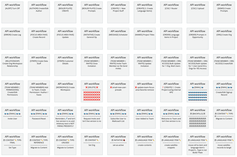
Basic Concept:
I don't actually use much color in my backend workflows.
The only time I do is when there's a really important multi-step flow or daisy-chain that I want better visibility on.
But for the most part, I keep it clean back there. 😜
The only time I do is when there's a really important multi-step flow or daisy-chain that I want better visibility on.
But for the most part, I keep it clean back there. 😜
However...
I DO use some pretty specific naming and emoji conventions, as you can see here. More on that below, GET 👁️ READY 👁️.
Basic Naming Convention
Backend Workflows
Example
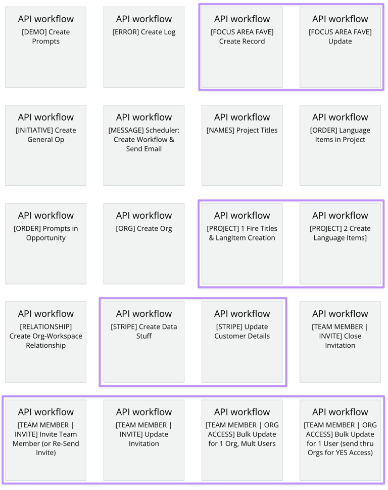
Basic Concept:
Add a consistent descriptor - typically the name of a data type - inside of brackets at the beginning of your backend workflow names, i.e., [PROJECT] in order to group them together.
Why take time to do this:
If it's even a remote possibility that another developer is going to work in your app, this is just a nice thing to do for them. You will also thank yourself for it.
It will make things easier to find, and keep you from creating the same workflow twice accidentally.
It will make things easier to find, and keep you from creating the same workflow twice accidentally.
How to do this:
This one is simple. Three things:
This will group workflows by data type or flow, and will make keep you from having to click into a bunch of workflows to find the one that does that thing you're trying to work on.
- If a workflow is primarily related to your "project" data type, add [PROJECT] to the beginning of the workflow name. If it's related to Stripe, add [STRIPE]. This is often a data type, but could also be a flow like [PAYMENTS] or [ERROR LOGGING].
- After the first bit in the brackets, add a clear description of what happens in the workflow.
- If you have a sequential flow, add a number in there to dictate the order they appear in.
This will group workflows by data type or flow, and will make keep you from having to click into a bunch of workflows to find the one that does that thing you're trying to work on.
Notes:
When you first create a backend workflow, you have to first name it in this little "API workflow name" field. But that field does not retain formatting in the title that's visible on the page when you're looking at all your workflows.
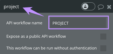
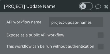
So I type something descriptive in that field without worry much about it, and then I change the title of the workflow manually to follow my conventions:
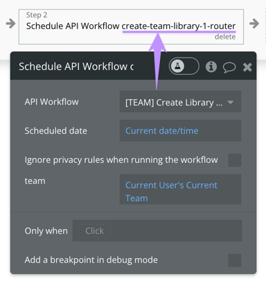
The only downside to this is that when you're scheduling a backend workflow from a page, the original name will be displayed in the action, rather than the manually-created one. Small thing, but somewhat annoying.
Triggers
Backend Workflows
Example
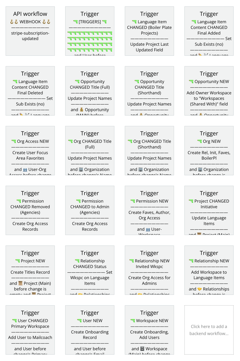
Basic Concept:
Name your triggers with a specific emoji + order + divider convention.
Why take time to do this:
Triggers are great, but they can bedangerous! If you create the same one twice, you can have a real problem on your hands. If you forget one exists, you have a problem on your hands. It's also hard to just look in your backend and see if you've got a trigger for something.
And because Bubble's default trigger naming is wonky and hard to understand by just reading it...
And because Bubble's default trigger naming is wonky and hard to understand by just reading it...
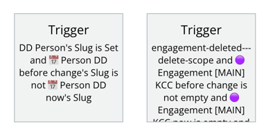
...trigger havoc is unfortunately easy to create.
A clear naming convention can help with all of this.
A clear naming convention can help with all of this.
How to do this:
Manually name your triggers with the following words/emojis in this specific order:
🔫 (gun) Emoji + Data Type + CHANGED or NEW + What Changed* + —————————— + What the Actions Do + ——————————
*Include the "What Changed" bit only if the trigger is a "change" trigger. Maybe that's obvious, I dunno.
Each item in this list is important...
- Gun emoji- Visually indicates that it's a trigger.
- Data type name- Groups other triggers for that data type together (critical!).
- Changed / New- Tells you what the trigger is without having to open it and read the conditional.
- What changed- Distinguishes one "change" trigger from another
- Divider Line- Visually separates the trigger from the action
- Actions- Ensures you won't create multiple triggers for the same action.
- Divider Line- Separates the actions from the conditional you used to create the trigger (Bubble will tag the conditional onto the end of your manual name)
Click to Copy/Paste:
I have no idea how to type those divider lines. I have to copy/paste it every time. Here it is for you, friend.
——————————
And here's the whole shebang, if that's helpful:
🔫 DataType CHANGED-NEW WhatChanged —————————— ActionDescription ——————————
Notes:
I'm not a fan of the gun emoji, despite being an American 😬. If you can think of a different emoji for this, please tell me.
I 100% stole the divider line thing fromPablo.
Migrations / Backfills
Backend Workflows
Example
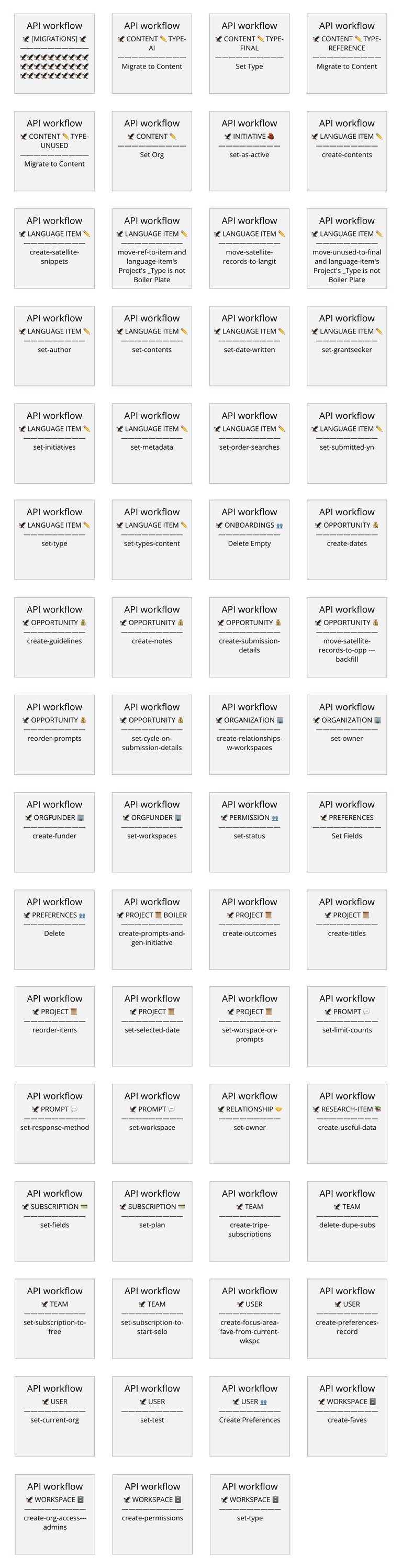
Basic Concept:
Name your migration workflows with a specific emoji + order + divider convention.
What this even is:
If you don't know what a migration is, congratulations - you've never made a mistake with your data structure! Or maybe you don't know you can restructure your data via bulk workflows. In which case, also congratulations, because you can restructure your data via bulk workflows, hooray!!!
Click here to learn what this is and how it works.
Why take time to do this:
It's easy enough to refactor your data in Bubble (thanks guys!), but you can end up with tonnnnnnns of workflows in your backend that you'll only really use once, and then they live in there cluttering up your view. They get mixed in with all of the workflows you're actually using on an ongoing basis, and you don't know if you can delete them or if they're being used somewhere important... You just end up with a big nasty mess.
Naming them this way separates them from your regular workflows so they're not in the way, and you can clean them out easily.
This also makes it easier to find the workflow you're looking for in your Bulk window (see below).
Naming them this way separates them from your regular workflows so they're not in the way, and you can clean them out easily.
This also makes it easier to find the workflow you're looking for in your Bulk window (see below).
How to do this:
Manually name your migrations with the following words/emojis in this specific order:
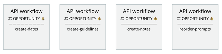
🦅 (bird) Emoji + DATA TYPE + Data Type Emoji + —————————— + What the Actions Do
Look how easy it is to find the migration you need in your Bulk view. Instead of being mixed in with all the other workflows for that data type, the 🦅 emoji tells you right away "HEY NERD, THIS IS A MIGRATION" and then the description of the actions tells you which one you need. WHAM BAM.
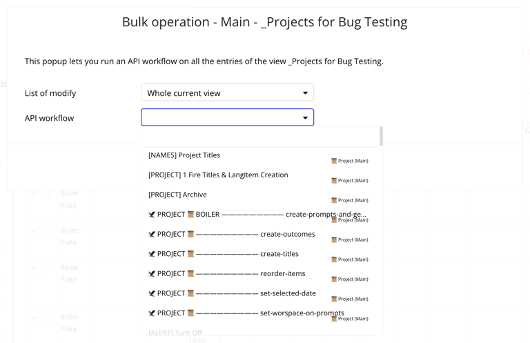
Delicious, right?
Recommended Emoji:
Birds migrate. And the eagle shows up more distinctly than the other birds (🦉🐥🐦 ). although they are admittedly cuter.
Some people use the term "backfills" instead of migrations. Potayto-Potahto, they're the same. But if you're in the backfills camp, I like the 🔙 (back) emoji.
Click to Copy/Paste:
Here's everything if you want to copy/paste it:
🦅 DATATYPE 🙃 —————————— action-description
——————————
Emails
Backend Workflows
Example
Basic Concept:
Put all emails in their own workflow (instead of in the middle of other workflows), and name them with a specific emoji + descriptor + divider convention.
Why take time to do this:
It's really easy to forget you've set up an email on the backend, and you can end up sending outdated stuff to users.
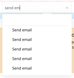
I never, never include a "send email" action directly within a workflow. Instead, I create a separate workflow JUST for that email, and then I schedule it from the main workflow.
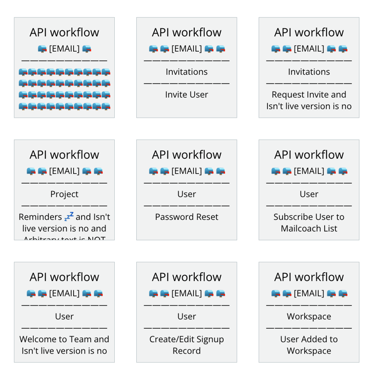
And then, of course, I emoji the crap out of those workflows. A la the stuff you see here.
This way all of my emails are grouped together, and I never lose track of what I'm sending. Also makes it easier to find in my Logs.
I never, never include a "send email" action directly within a workflow. Instead, I create a separate workflow JUST for that email, and then I schedule it from the main workflow.
And then, of course, I emoji the crap out of those workflows. A la the stuff you see here.
This way all of my emails are grouped together, and I never lose track of what I'm sending. Also makes it easier to find in my Logs.
How to do this:
Manually name your email workflows with the following words/emojis in this specific order:
Two 📪 emojis + "[EMAIL]" + Two 📪 emojis + —————————— + The general thing/data type this email is about + —————————— + The function of the email being sent
This makes it easy to see what each email is, and sorts emails regarding the same thing together. For example - all "project"-related emails (new project, project status updated, project cancelled, etc.) will all be grouped together.
This way, it takes about 5 seconds to find and edit a project email, or to see if one already exists before creating one.
The alternative is to search for "send an email" and look at every single action in your backend to find the one you're looking for.
This way, it takes about 5 seconds to find and edit a project email, or to see if one already exists before creating one.
The alternative is to search for "send an email" and look at every single action in your backend to find the one you're looking for.
Recommended Emoji:
There are a number of mail-related emojis, but I find the 📪 to be the most visible and distinctive. (Most of the others are some version of a white envelope, and white just doesn't stand out very well in your workflows or logs.)
Click to Copy/Paste:
Here's everything if you want to copy/paste it:
📪📪 [EMAIL] 📪📪 —————————— Regarding —————————— Function of Email
——————————
Note:
I also include the word "EMAIL" in the workflow title so that it's easy to search for.
📂 Folders
Organize your workflows (or not...)
Folders
App Organization
Example
Surprise!
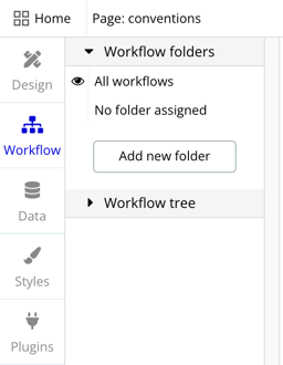
I almost never use folders. Here's why:
Some people love them, though. Here's my understanding of why...
- Assigning a workflow to a folder takes so many clicks, and you can't do them in bulk.
- You can't drag a workflow into a folder.
- You can only assign a workflow to one folder. If they worked more like tags, they'd be more useful.
- I forget they exist.
Some people love them, though. Here's my understanding of why...
Why you might take time to do this...
If you have a lot of workflows on a page, it can be useful to create a more focused view, where you're only seeing the workflows related to a particular flow or feature. It can make it easier to tune out the rest of the stuff and not get distracted.
I've seen other devs organize folders in a number of ways, including...
I've seen other devs organize folders in a number of ways, including...
- By flow
- By data type
- By feature
Okay sure, but...
Maintaining folders (or rather, not maintaining them) can lead to the creation of duplicate workflows, so I never trust that a folderactuallycontains all the workflows that should be in there. I actually think they're a little dangerous.
But each to his own. If you wanna use folders, have at it.
But each to his own. If you wanna use folders, have at it.
🖌️ Styles
Create and sustain visual consistency in your app
Naming
Styles
Example
Basic Concept
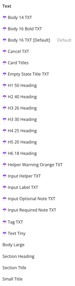
Add an ☂️ emoji to the beginning of styles you're using, as well as abbreviations for searching and other descriptors like font weight, font sizes, colors, or purpose. I also name these in a specific order, which is probably overkill but works for me.
Why take time to do this...
Bubble comes with a bunch of styles that you'll either change or never use. It can be hard to know which styles are ones you're actually using, and which can be ignored.
It can also be hard to know what a style actually means, since there's no preview when you're selecting it in the editor.
It can also be hard to know what a style actually means, since there's no preview when you're selecting it in the editor.
Emojis
Anytime I create or edit a style and put it into use, I add an emoji to the very beginning of the name. This provides a visual indicator (to myself and other devs) that it's an actively-used style, and it's safe to select.
I like the umbrella ☂️. Because umbrellas areuse-ful, and these are styles I'muse-ing. 😏
I like the umbrella ☂️. Because umbrellas areuse-ful, and these are styles I'muse-ing. 😏
Abbreviations
For any styles I'm using, I append the element type abbreviation to the end of the style name. For example: GR, INP, etc. (see the "Page Elements" section above)[/li]
The reason I do this is that, In the styles view, if I want to quickly find my group styles, I can type in "GR" and the big long list on the left will filter. This saves me from having to visually find the "Groups" section
The reason I do this is that, In the styles view, if I want to quickly find my group styles, I can type in "GR" and the big long list on the left will filter. This saves me from having to visually find the "Groups" section
💠 Apps Within an App
Using Coalias to use multiple domains within one Bubble app...
Naming conventions for multi-app apps
Apps within an app
Example

What this even is:
There is an extremely cool service calledCoalias, which allows you to use multiple domains within a single Bubble app.
The app you're viewing right now uses Coalias for my portfolio, the DevDay app, my wedding website... One day I might even put this page on its own domain, just for funzies.
The app you're viewing right now uses Coalias for my portfolio, the DevDay app, my wedding website... One day I might even put this page on its own domain, just for funzies.
Note: I'm about to call these apps-within-an-app "sub-apps" which I know is an actual thing in Bubble that has nothing to do with the thing I'm talking about. Sorry if this causes confusion.
The difficulty of sub-apps:
You end up with styles for each individual sub-app, data types for each individual sub-app, option sets for each individual sub-app... If you don't have a visual way of distinguishing all of this stuff, everything will be all mixed in together and you won't know what's what.
What to do about it:
An emoji for each sub-app- Pick an emoji for each app. Put it at the beginning of your data types, option sets, and styles. In the example to the left, you can see I'm using 💍 for wedding stuff, 📅 for DevDay, and 🟣 for my portfolio website.
Abbreviations- Decide on a specific abbreviation for each of your sub-apps and add it to the end of your data type names, option set names, and style names. The purpose of this is that eventually you will have a ton of DTs, OSs, and Styles, and by having the abbreviation means that you can just type it into the search box and those lists will be filtered to show only the ones for the subapp you're working with.
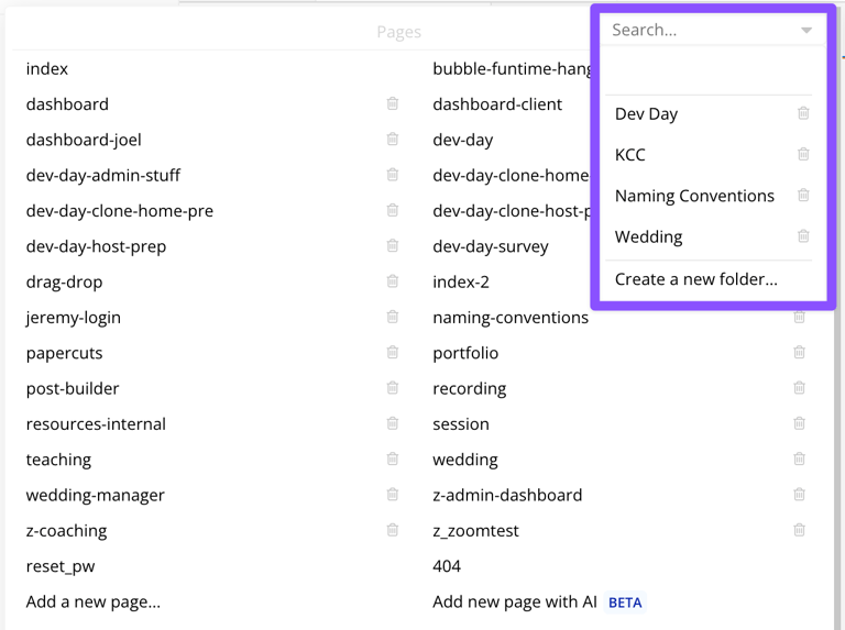
Folders for Pages- As much as I don't really like using folders in a typical app, I do find them incredibly useful when working in an app that has sub-apps.
That's it!
That's it! I hope this was useful. And if not, perhaps it was at least an interesting read? Would love to hear your thoughts - and if you have a way you do things that you think is better, please let's hop on a call and duke it out. 👊